Last class

My Granola package consists of a paper that is wrapped around a plastic bag. The paper is folded into a triangular prism shape. The paper wrap is open to the side so that you can see the plastic bag with the granola inside. In order to be as environmentally friendly as possible, the wrap will be seed paper and the plastic bag will be compostable.

I am very content with what I came up with and how it worked out in the end. I think the package would really stand out in a store in comparison to the mainly rectangular shaped granola packages.

Digitale Design

For this week I focused on the digital design as well as the dimensions of the package. I tried to work as close as possible to the new design of the juice bottles. To distinguish the different flavours, which are now given, I will use different colours and a unique phrase for each one on the front panel. 

The front panel shows the name and the product (“not your average granola”), some of the ingredients, its unique phrase and a small banner with the little leaves from the logo. The complete list of the ingredients, the nutrition facts, a tip how to make the most out of the granola, the logo and weblinks are displayed on the back side. The sides are open in order to see the bag with the granola. On the inside of the package the life cycle of the juice and how to use the seed paper will be explained with the help of icons, which I am currently working on.

Prototype, Prototype, Prototype

So this week Andrea from GoodLife Juice came to our class to take a look at our first drafts. I had some ideas which I already had doubts about in terms of the realization and now that I could talk about them with Andrea she also confirmed that it is too complicated to produce.

So now I am going with a triangular prism shape. It has a transparent plastic bag inside (optimally compostable – I need to do some research here) and a seed paper wrap around it. I still want to experiment some more with the shapes and sizes and how the two materials can work together.

Project 2: Ideation

For the last project I did not do many sketches, so for this one I got the task to do a lot more. I must say that was not easy for me, and yes I procrastinated a bit before starting. I like to think ideas through in my head and develop them and when I like it, sketch it out to remember it. I see the reason behind sketching a lot of ideas very fast and so I tried to do it this time. I got some ideas now, that I don’t know if I would have had if I didn’t do the sketches.

It is quiet difficult to create a package for granola that is creative and distinct and at the same time environmentally friendly and optimally has a “window” that shows the product. I will probably need to go with cardboard to make the package sustainable, even though I would like to use plastic. I thought about compostable plastic, but that is probably creates difficulties for our client to order and work with.

I am still motivated and curious what I will be able to come up with.

Project Brief

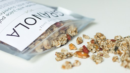
Branded package series _ Granola for Goodlife Juice Company

Objectives

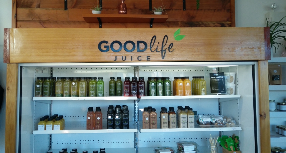
Goodlife Juice is a company producing mainly cold pressed Juices, but also selling medical plants and special herbs. Now they want to introduce a new product: Granola.

The brand stands for a healthy, but fun lifestyle and promotes people to feel good and in harmony with themselves. The company does not take itself to serious, but is honest and playful. The brand design is clean, but emotional with a feminin touch in colours and modern shapes and typography. It is soft and „beautiful“ but still high-end and classy.

The product is granola, which is raw and dehydrated instead of baked and has pulp of the juices in it. Freshly made almond butter is used and it is sweetened as little as possible. It is a healthy and natural product made entirely on Vancouver Island. To the existing granola mix two more flavours will be added.

good-life-juice-granola-instagram-two.jpg

The package needs to be environmentally friendly, but still look classy and not too „natural“. It should be made of compostable materials and it needs to be air sealed. The design should be long lasting and not subject to trends. The front can only be in English, French text can then be on the side. The logo is not the most highlighted part and can be placed on the backside of the package. Nutrition facts and ingredients have to be on the package. It is most important to communicate the playful, healthy spirit of the company. It is optional to display the story about the company or the recycling of the pulp as farm animal food. The package can also educate the consumer about recycling and protecting the environment.

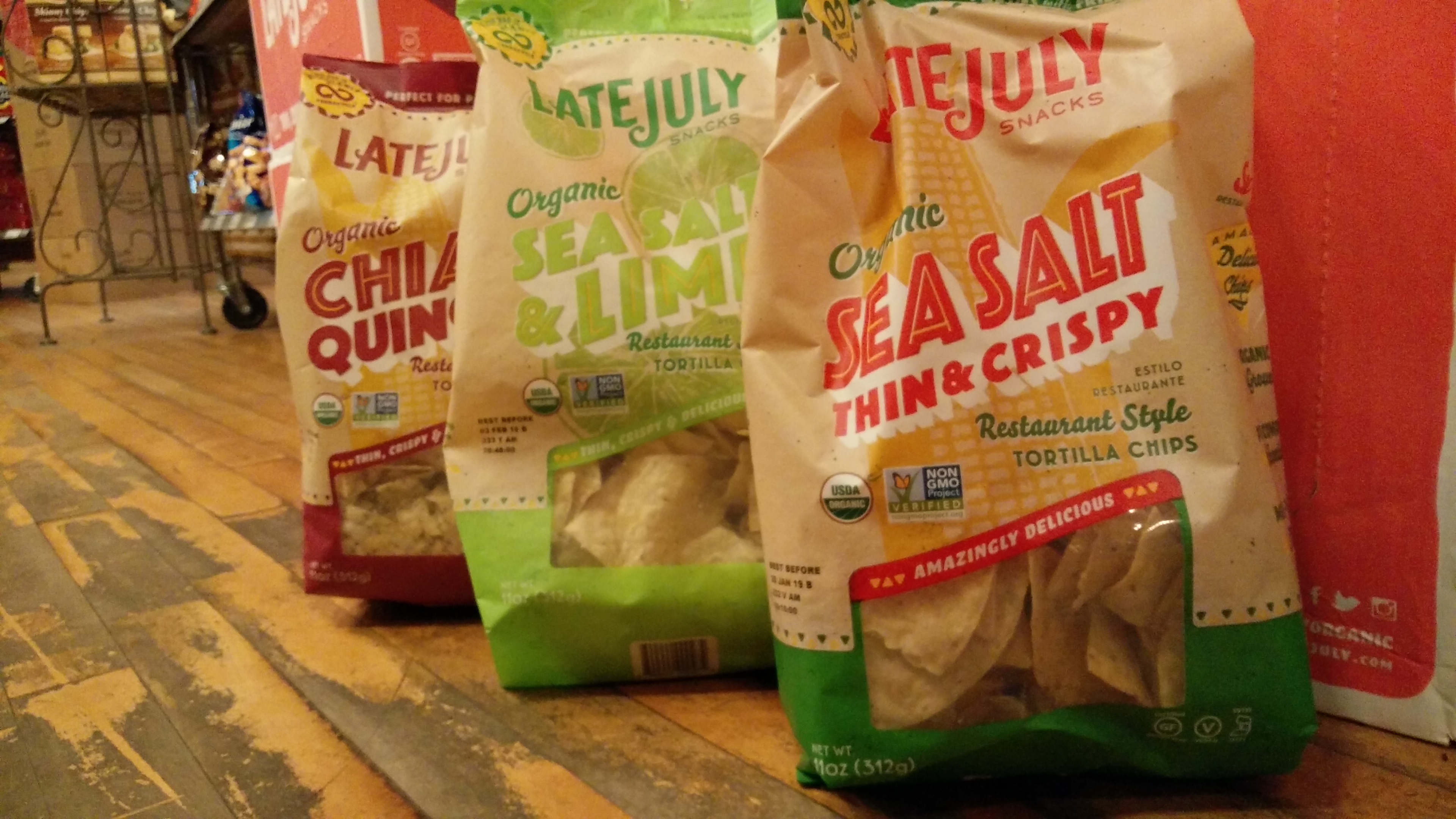
The goal for the granola is to be sold internationally and therefore a longer shelf life should be considered. The competition uses mainly cardboard boxes, sometimes with a plastic bag inside, as well as just a plastic bag. The design is often very colourful and the package shows a photo of the product on the front panel, but there are also minimal designed packages and packages with windows directly showing the product.

Audience

Generally the product is open to everybody that is interested in a healthier lifestyle and eating wholesome. The consumer is a person that is willing to pay a little extra for good natural granola. Generally the company is focusing on women, probably aged between 20 and 60 years.

Desired Response

The package should give the costumer the feeling of buying something really valuable and healthy. He needs to now that it is worth it to pay a little extra. The package and the product should make the costumer feel good about himself.

Creative Considerations

I will need to consider the high-end appeal and make sure the package does not become too playful or natural looking. The environmental aspect is very important to the company and needs to be ensured. 

Field Trip: Packaging Series

This week we went on a field trip to Coombs Market to investigate packaging series and how they manage to differentiate flavours within a consistent design.

Series #1

IMG_20181030_094325.jpg

This series of chocolate is consistent mainly through their overall layout – they only display a drawing of an animal dressed like a celebrity and the company’s logo on a colored background. The company’s logo is the only object that stays the same throughout all the packages. Of course the size also stays the same. The design differentiates the flavours not only by color, but mainly with a different drawing for each one.
In general the company chose a simple design that draws the attention towards the illustrations, and these attract the costumers attention. The animals referring to celebrities have a fun-effect, that made me smile and laugh about it, and also give me a sense of accomplishment as I was able to figure out who it was referring to.

Series #2

IMG_20181030_095046.jpg

This series of Tortilla Chips is consistent through the layout, fonts and retro-like style. The shape and material of the package itself remains the same. The most obvious design choice that differentiates the flavours is the colour, that does not just affect the background colour like in the example above, but the different elements, like the fonts and shapes and even the logo. Less noticeable are the different illustrations in the background that refer to the flavour of the chips, but also these distinguish the packages.
Overall the package design displays many elements on its front side and is very “colourful” in terms of not only the colours themselves but also of the fonts, as they chose many different styles.

Rationale

Ideation and purpose

To begin with, the overall goal was to make an environmentally friendly design, meaning less material in general, as well as sustainable material – cardboard rather than plastic – and optimally a part of the package would be reusable so that it would not be entirely made to be thrown away later. To tackle a common users’ pain with headphones, the tangled cables when storing them in the pocket, was also part of the ideation process. 

Package concept and features

The basic idea of the package design is the cardboard pipe in which most of the product is stored. This pipe combines the goals to create something reusable and to tackle the users’ pain with tangled cables, as after the purchase you can keep the pipe to wrap the headphone cable around and thereby prevent it from being tangled up. The pipe has two cuts on both sides which at first hold the piece of paper which displays the information and is used for storage, but later can be used to fixate the heads of the earphones. The pipe also has a hole that the plug can be tucked into and an additional cut on one side where the cables are tugged in when the lids are closed. The pipe holds two more sets of earpieces in different sizes as well as an additional piece of paper with the products warranty.
The piece of paper attached to the pipe has a few features. First it has two rounded ends that function as lids for the pipe and attach the paper to it. Then it has a cut-out at the top to hang it up in the store and two rounded cut-outs in which the heads of the earphones are plugged into to display them to the costumer. This piece of paper is to be thrown away after the purchase and is therefore designed to be as small as possible but to still hold all the important information.

Design concept

Generally the design should say ”environmentally friendly“ which is achieved by the cardboard paper whose brown texture is visible. The typography and layout is clean and simple and focuses on transmitting information. The lines that are drawn on the paper as well as on the pipe give the design a playful character and remind of the headphones’ cable.
The front of the paper only shows the name of the product, the logo of the company and a short explanation about the product. The costumer can see the product itself and touch it to see if he is generally interested in buying it. On the back of the paper the customer can find all the technical information he needs to set on his choice. The illustration on the back also supports a fast uptake of the basic information.

Competition

The grand majority of the competition uses a plastic oriented packaging which is similar to the packaging of these headphones as it is now before the redesign. The ”environmentally friendly“ look with the brown cardboard in comparison to a lot of white colors and plastic materials draws attention to this package. Also the emerging awareness of sustainable packaging and waste reduction of the customer can be a great reason to choose this product as most of the competition does not yet focus on this aspect.

Conclusion

The redesigned package of the headphones achieves the goals set before in the project brief. The sustainability aspect was considered and material was reduced to a minimum amount. Also the goal to make the package reusable and to tackle the users’ pain with tangled cables could be reached.

Redesign Package Finishing

I mostly worked on my digital work and almost finished the design. It was quite a challenge to reduce the information that needs to be on the package to its shape. I needed to extend the piece a few centimeters to make sure everything fits on it.

Concerning the shape and assembling of the package I need to make some improvements to the flaps and cut outs. I bought a cardboard roll to cut out the roll that the earphones should be wrapped around.

Today a group of students visited us to give feedback on our work. They liked the idea of reusing the roll to organize the earphones, but I think I should make it clearer that this is intended and so I will create a graphic to explain how to use it. The students said that they understood all the information on the package and liked how minimal it now is concerning material and that it is recyclable. They responded very positively to the new design and found it very clever and useful.

I am now excited to finish the project and see it as a pristine prototype. I hope consumers would see that the roll is intended to be reused and would actually do it.

Sketch Model Mock-Up

Today I focused on one of my ideas, which I think would be best. So I cut it out on bristol paper this time. Now I am trying to get the opening lid and the proportions right. First the tube was to small so now I need to make a new one, so that the cable and the additional things of the headphones fit in it. After I got that right I will start with the piece of paper that is attached to the tube, which will display the logo and information about the product. I will need to figure out how to present the information on that paper and then start to work on the design and layout.

This day was good for me to experiment with how that specific package idea could be further enhanced. I know now how I would like it to be, so now I need to figure out the measurements and shapes it needs to have in order to be cut and folded properly. I will do a new sketch model mock-up for next week and then start with the graphic design.